Visual identity & campaign system
October 2026
The brand book.
Reach
what’s next.
One identity. Every next expression.

Identity / Digital / Campaign / Printnextreachstudio.in
A working reference for every next design.
Explore the chapters ↓Visual identity & campaign systemThe brand book.
One identity. Every next expression.
Start with the signature. Build with the system. Express it in context.
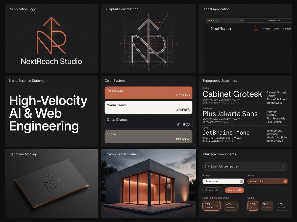
The overview is a mood reference. The exact colors, typefaces, and dimensions on the following pages are the production specifications.
Visual craft that makes the business recognizable.
Websites, digital products, and connected AI systems.
A direct founder relationship and source-code ownership.
For founders and growing businesses. Confident, technical, human, and understated. The core line is “Reach what’s next.”
Plain words. Specific outcomes. Confidence without exaggeration.
Say this
Direct / ownership-led
Avoid this
Abstract / agency cliché
Say this
Human / outcome-first
Avoid this
Unverified / manufactured urgency
Use the supplied masters. The geometric symbol stays separate from the wordmark.

 120 SVG units150 SVG units
The arrow expresses reach and forward ambition.
A central pillar connects the geometric N and R forms.
One monoline drawing. No lettering inside the symbol.
Scale the entire SVG proportionally. The master paths, rather than a reconstruction or approximate angle, define the emblem.
Keep at least 1X clear around the visible emblem or complete lockup.
1X1X30 units in the 150-unit master canvas.
For lockups, derive X from the scaled emblem. Protect the entire group, including the wordmark.
Digital minimum / 6.25 mm high in print
Digital minimum / 28 mm wide in print
Digital minimum / 20 mm wide in print

On a 1080 px ad, start at 240 px for the full lockup. Judge it at a 360 px phone preview.
Use the supplied favicon and avatar assets for tiny UI placements. Do not squeeze in the full wordmark.
Digital minimum previews are rendered at their stated CSS sizes on screen; print and device scaling can change their physical size.
Also avoid redrawing the paths, changing stroke weight, adding letters inside the symbol, or cropping the identifying logo.
RGB 199 / 107 / 80
Signature & graphic emphasis
RGB 42 / 42 / 45
Dark canvas & primary text
RGB 245 / 241 / 233
Light canvas & reverse text
RGB 166 / 157 / 146
Quiet detail on dark surfaces
RGB 255 / 255 / 255
One-color marks & clean contrast
Accessible small text and buttons on cream.
Accessible small text and buttons on charcoal.
The five core colors follow BRANDING.md. Functional rust shades come from the live homepage. Legacy asset backgrounds are not new palette tokens.

Treat the rust canvas as a display composition. Move small essential copy to a charcoal or cream panel.
Measured WCAG contrast. Body and button text need at least 4.5:1; large text needs 3:1.
12.70:1 / body & display
5.71:1 / body & buttons
6.04:1 / body & buttons
3.30:1 / large text only
Stone on cream is 2.37:1: decorative use only. Stone on charcoal is 5.36:1. White on signature rust fails normal-size text.
ABCDEFGHIJKLMNOPQRSTUVWXYZ / abcdefghijklmnopqrstuvwxyz / 0123456789
700 to 800 weight / tight tracking / short headlinesUse the bundled font files, not lookalikes. Preserve supplied logo artwork instead of resetting its wordmark.
Starting sizes for a 1080 px social canvas. Scale the whole hierarchy when adapting formats.
Websites and digital products
built to move your business forward.
Websites / AI / Digital products
Display tracking: −0.04em. Body: 0. Labels: +0.06em. Use sentence case; avoid condensed caps and long mono paragraphs.
columns for campaign masters
72 pxouter margin on a 1080 px canvas
24 pxgutters between columns
8 pxbase spacing unit
Spacing scale: 8 / 16 / 24 / 32 / 48 / 64 / 96. Align type and images to the live-area columns. Mobile layouts simplify to one column.
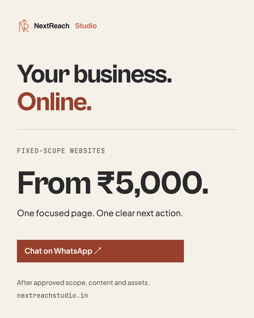
Fixed-scope websitesOne clear starting point.
Chat on WhatsApp ↗Keep a dominant focal point and generous negative space. The service can change; the identity, type hierarchy, and grid stay familiar.
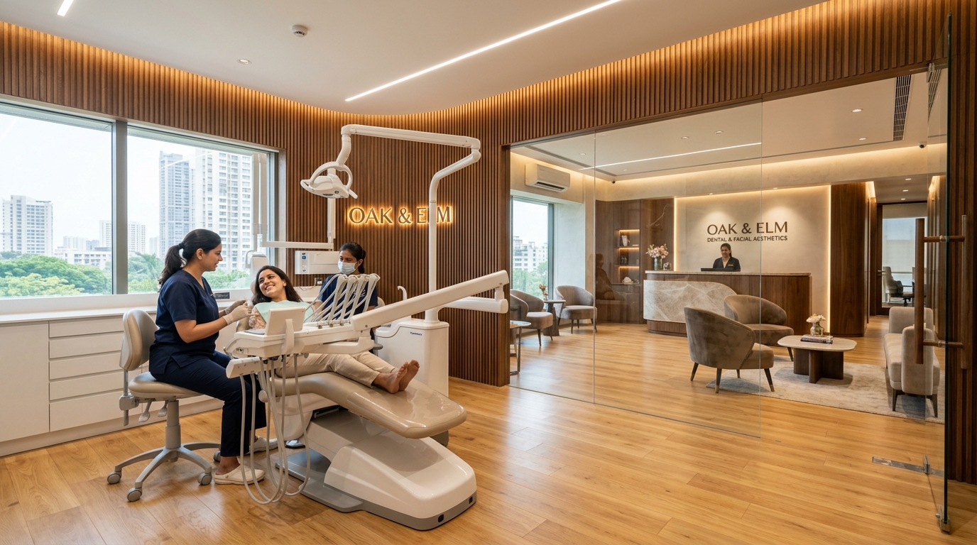
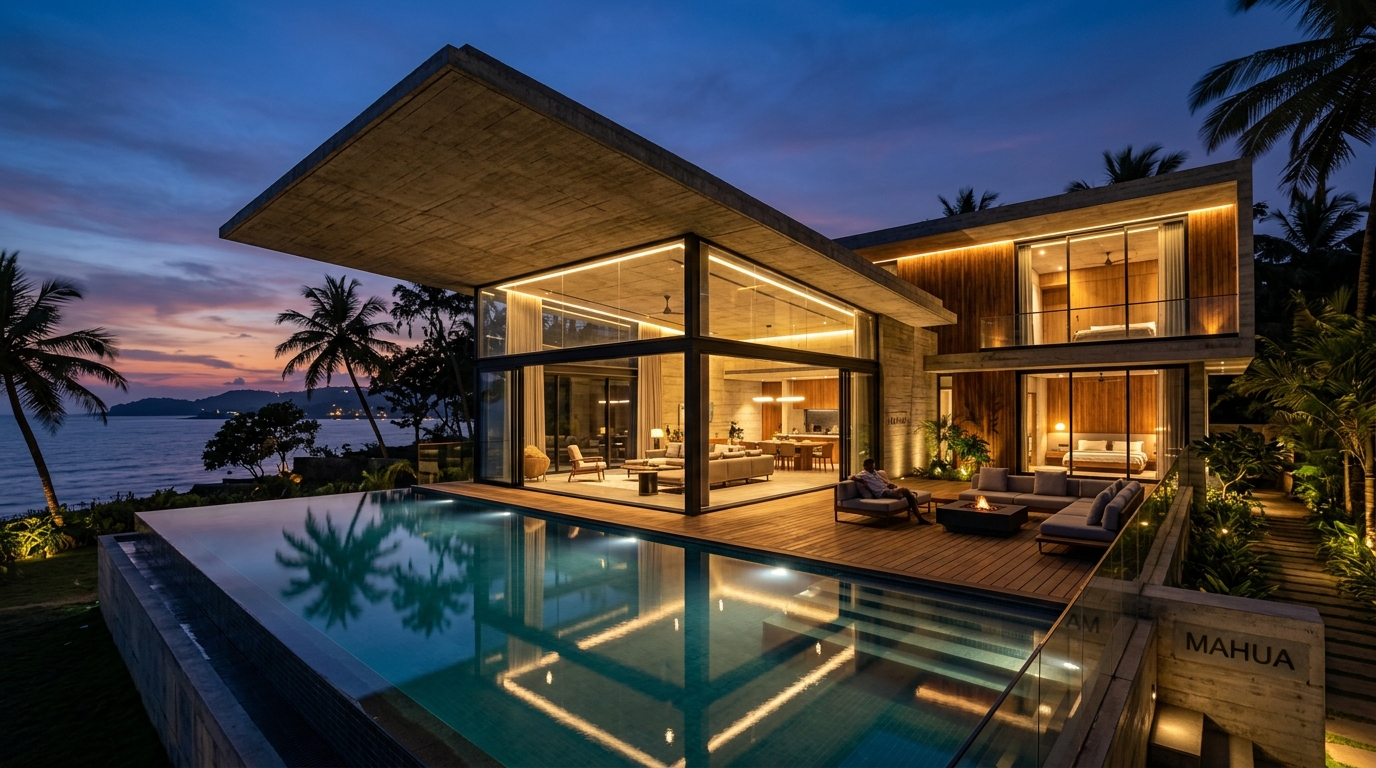
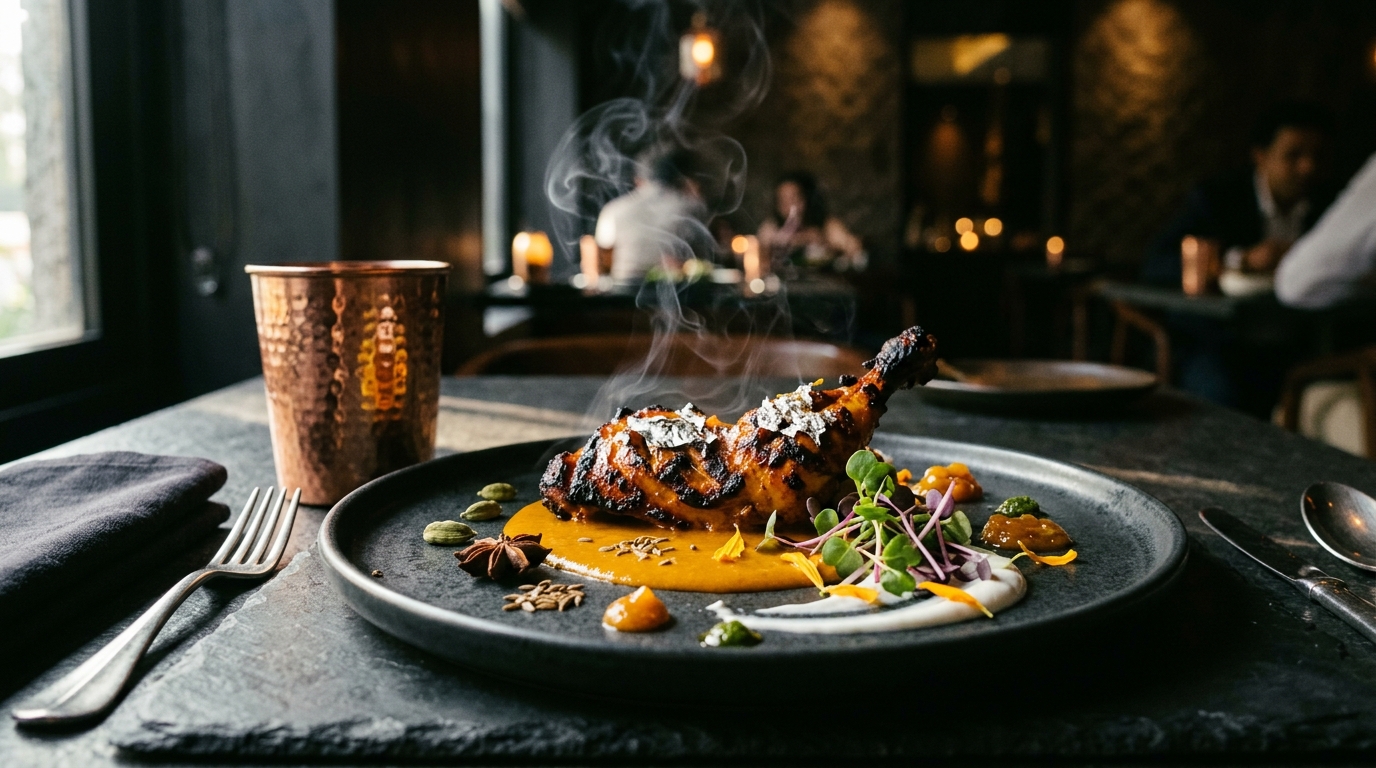
Existing demo images illustrate direction, not client endorsements. Use original project photography or properly licensed images for new campaigns.
Place type in quiet space. Check actual contrast. Avoid heavy color casts, gratuitous blur, or filters that hide the work.
Use simple architectural geometry, not decorative tech clutter. No neon halos, random blobs, generic AI brains, or competing accent colors.
A focused website, a useful product,
or a workflow that gives time back.
Interactive specimens only; no information is submitted.
Campaign frames: 0 px radius.
Controls: 0 to 4 px radius.
App icons: use the supplied squircle.
Primary: deep rust + cream.
Hover: a subtle tone change.
Focus: a visible 2 px outline.
44 px minimum touch target.
Never communicate state through color alone.
Small distance. Clear hierarchy.
Reveal the next piece of information.
Leave the message still and readable.
Hover & pressed feedback
Single entrance or scene change
cubic-bezier(.23, 1, .32, 1)
Animate opacity and transform. Avoid constant spinning, flashing, or motion behind body text. Reduced-motion users receive a static or instant transition.
Editable vector masters and matching PNGs. Change the message, not the identity.


Logo → headline → offer → action.
One service or package per creative.
One domain. One necessary condition.
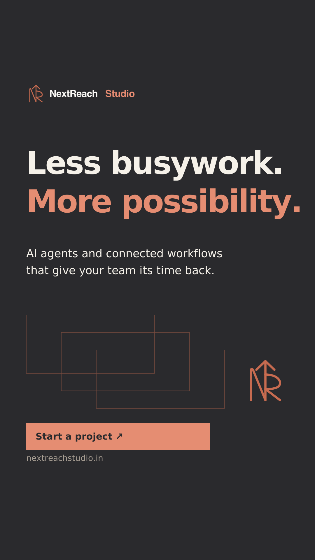
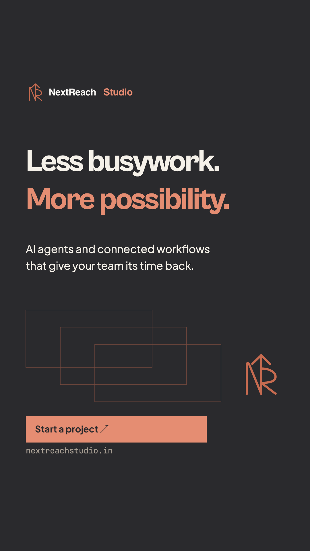
9:16 / stories & vertical placements
250 px top and 340 px bottom. Placement UI can vary; confirm the current ad preview before publishing.
Editable SVG ↓Compose the vertical version separately. Do not simply stretch a feed design or move the CTA into the platform’s overlay area.
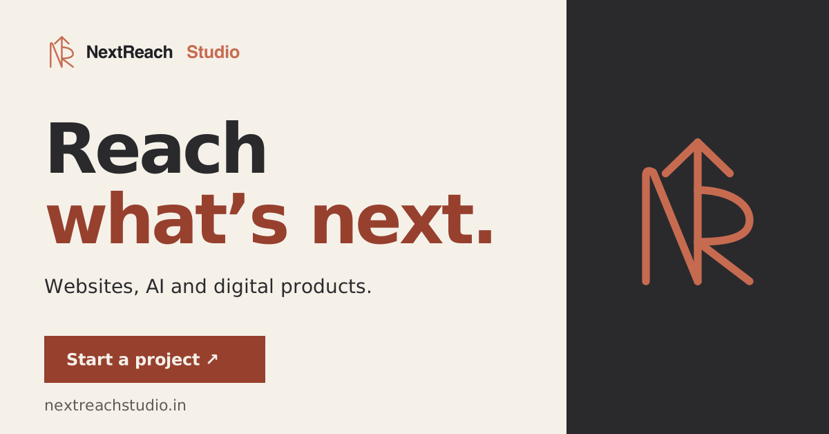
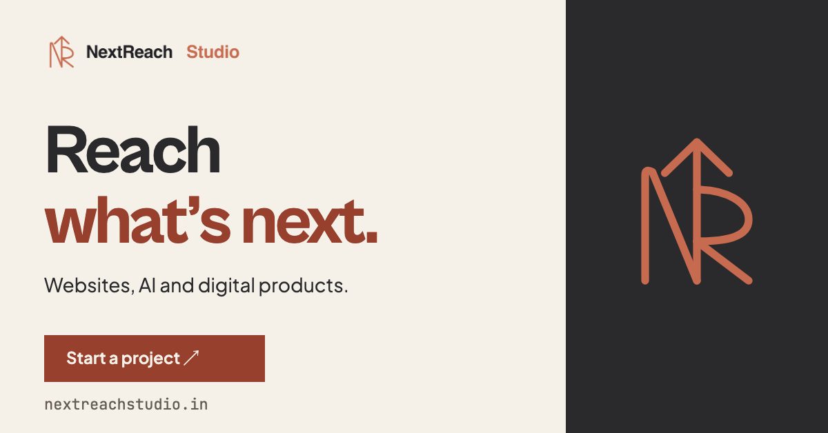
Approximately 1.91:1 / landscape ad reference
Keep the headline left. Give the emblem room on the right.
For a 1200 × 630 link-preview image, use the separate exported variant. Check the destination platform’s current crop and compression.
Demo work / 04 / 05One thought per slide. Repeat margins and logo placement. For results, show only measured, attributed project evidence.
Reach what’s next.Founder & Principal Engineer
hello@nextreachstudio.in
+91 98223 79976
Project proposal
Scope / Timeline / Investment
Layout specimens, not photographs of manufactured items. Keep logo clear space and use stock and finishes that preserve fine strokes.
Awareness, a specific offer, or a demo.
Type-led, image-led, or offer-led.
One headline and one next action.
Show work; attribute measured results.
Phone size, crop, contrast, destination.
1 to 2 days / fixed scope
2 to 3 days / fixed scope
3 days / fixed scope
Delivery begins after approved scope, content, and assets. Verify current inclusions and pricing at /fast-websites before each campaign.
WhatsApp ad action: “Chat on WhatsApp” → a prefilled chat. General project action: “Start a project” → /contact. Demo action: “Explore the demo” → the actual demo.
sRGB / PNG for graphics
JPEG or WebP for photography
Export at exact placement dimensions
Keep an editable SVG master.
Recheck text after platform compression.
Use the printer’s ICC profile.
300 ppi for placed raster images
3 mm bleed / 5 mm safe margin
Convert fonts to outlines in final print artwork.
Proof terracotta on the chosen paper.
Preserve viewBox and proportions.
Use supplied monochrome masters.
Keep live text in the editable file.
The book PDF is a reference document.
Create press artwork to the printer’s spec.
nextreach_[campaign]_[format]_[variant]_v01.pngHEX and RGB are the digital source of truth. CMYK is output-profile dependent; there is no invented universal Pantone or CMYK match.
Logo masters / fonts / tokens / ad templates / PNGs
Monochrome, stacked, app & profile variants
This book extends the existing identity with practical campaign rules. Brand contact: hello@nextreachstudio.in / nextreachstudio.in/contact.
Primary-source web research completed with TinyFish CLI on 7 October 2026.
Precise logo variants, protected space, and visual misuse examples.
nasa.gov / NASA Brand Center ↗A repeatable spatial unit connects type, margins, and image proportions.
ibm.com / design / language / 2x-grid ↗Show the correct treatment beside the incorrect one; make assets easy to find.
developer.spotify.com / documentation / design ↗Keep the voice consistent; adapt the tone to the reader and situation.
styleguide.mailchimp.com / voice-and-tone ↗